High gloss: At the top of the sheen spectrum, high-gloss paint gives trim and doors a bit of drama. And while it can be used on walls to stunning effect, take note: The higher the gloss, the less forgiving the paint. “As you’re going up in the scale, more light is being reflected,” Andrea says. “You’ve got to make sure your walls are in perfect shape, because any imperfection is going to be amplified.”
How to Pick Paint Colors with Confidence
G iven the time, money, and effort involved, painting a room is a real commitment—which is why many of us let paint swatches languish on our walls for months, agonizing between shades of not quite white and barely there gray.
To help make the process a bit more painless (and dare we say, fun?), we tapped Andrea Magno, Benjamin Moore color and design expert, to share her expert approach to painting with confidence. From the best method for testing shades to the one small-space rule we can (finally!) ignore, read on as Andrea answers our most frequently asked questions about all things paint.
In the New Orleans home of luxury-linens maven Jane Scott Hodges, zingy chartreuse walls make a bold statement—but thanks to the room’s ample natural light, the color doesn’t overwhelm. Photo by Tony Vu.
First things first: Where do I start?
Andrea Magno: We always tell people to find some point of inspiration. Let’s say it’s a kitchen and you have a countertop with veining in it—pulling color from that is one way to go. Maybe it’s starting with an area rug or window treatments. It can even be as simple as a pillow fabric. Using some kind of guide is going to help you narrow down which color families you want to look at.
When you’re trying to figure out what mood you want to create, you have to give a lot of thought to how different colors make you feel. If you’re wearing green do you feel particularly good? What colors are you drawn to? That can help shape the direction you want to go in when you’re choosing color.
Okay—I know what color family I like. Now how do I pick a specific shade?
AM: Start by asking where you want to be lightness- to darkness-wise in that color family—do you want a really pale blue, or do you want navy blue? That’s the next step in narrowing it down.
Once you figure that out you can start comparing different colors. I always urge people to compare colors next to each other or overlap them, so that you start to pick up on undertones. That’s going to help you say, “Maybe I like the blue-green versions of blue as opposed to ones that go a little bit more purple.” And at that point you would start testing the colors to see how that variation on blue is going to work with your lighting.
A Brooklyn kitchen goes sleek and chic in allover white—from the cabinets to the ceiling to the floor. Home of Jenni Li; photo by Lesley Unruh.
And what about white? There are seemingly infinite tones.
AM: That’s where I think it’s most important to compare one color to the other. I like to literally overlap the two colors. If you have two whites and you’re looking at them in isolation, they’re probably going to look alike. But if you take those two color chips and put them one on top of the other, you start to see that one is a little bit more creamy, and maybe the other has more of a green undertone. But you wouldn’t be able to appreciate that until you have them right on top of each other.
What’s the best way to test shades in my space?
AM: Once you get down to two or three colors that you’re really torn between, we usually encourage people to buy a pint sample rather than work off a one-inch-square paint chip.
If you paint out a piece of foam core, for instance, you’ve got a really big chip, and you’ll be able to move it around the room and understand how the color is going to work in the morning light versus the evening light. Then you can make a color decision with a lot of confidence—because you’re not making a guess. You’re almost living with the color. And it’s better to paint a sample color onto something like foam core as opposed to painting it on the wall itself, because the existing color is going to throw you off.
It might take some time, but if you can take that extra step of actually sampling the color, then you wind up with something that you’re going to be happy with for a much longer period of time.
Soft light gives lilac-toned walls a dreamy, changeable vibe in the NYC home of designer Katie Leede. Photo by Lesley Unruh.
How does natural light come into play?
AM: If you have a southern-facing room with that strong sunlight coming in, that opens up a lot of possibilities as far as what colors will work well; you can bring in a darker color or a color that’s a little bit more saturated, because you have that light to balance everything out.
Sometimes northern light can do some strange things to colors—they can pick up a different undertones. Which, again, is why it’s really important to sample them!
It might take some time, but if you can take that extra step of actually sampling the color, then you wind up with something that you’re going to be happy with for a much longer period of time.
— Andrea Magno
An apple-green dining room plays nicely with adjacent blue-painted cabinets in the Harlem home of designer Sheila Bridges. Photo by Manuel Rodriguez.
What impact does the wall color of adjacent rooms have?
AM: You want an easy transition from one color to the next. If you have a really stark contrast, it’s going to take the eye a little more work to adjust. But you can also think about that inspiration point, so you have some element that’s tying everything together—whether it’s a rug, a countertop… And you’re able to make a connection that makes the transition from one color to the next seem logical.
Once and for all: Are dark colors a no-go for small spaces?
AM: I feel like that’s one of those myths. You can use a darker color in a smaller room and it’s going to be really dramatic—it can make the room almost feel bigger in a way. I like to use the example of the sky at night: It looks huge and expansive; it doesn’t feel like the sky is falling in on you. It’s the same concept. When you get into the corners and the shadowed areas of the room, it’s going to blur the lines, so you’re not able to focus on definite beginning and ending points.
A deep green hue lends depth to a small dining room in artist Frank Faulkner’s upstate New York home. Photo by Pernille Loof.
I finally painted the room—and I don’t love it. What now?
AM: You could always repaint it, but if you want to avoid having to go through that work again, one of the easiest things you can do is play around with the light bulbs in the room. Different light bulbs have different color temperatures, and they’re going to have an impact on the way the color looks on the wall.
Usually if the light bulb is really cool, it’s just not as appealing or welcoming, so switching to a warmer light bulb will sometimes do the trick. Instead of bringing the drop cloth back out, that’s a very easy way to course-correct.
Tell me more…
AM: A lot of the LED bulbs out now are very comparable to traditional incandescent bulbs, and they’re pretty warm. Compact fluorescent light bulbs [CFLs] are going to be cooler and probably less appealing. Be sure you look at the color-rendering index: If you have a color-rendering index of 85 to 100, that’s really good. A 70 is where you get into trouble.
You can use a darker color in a smaller room and it’s going to be really dramatic—it can make the room almost feel bigger in a way.
— Andrea Magno
In a range of soothing blue tones, designer Kate Brodsky’s monochromatic Manhattan bedroom radiates calm. Photo by Lesley Unruh.
Color Schemes, Simplified
Andrea pulls out her color wheel (so you don’t have to), digging into the three basic types of color combinations:
Monochromatic color schemes rely on variations of a single color and are often the most approachable, Andrea says: “Usually these are very easy on the eyes.” To keep things interesting, play around with different undertones within a color family.
Analogous color schemes incorporate hues that are next to each other on the color wheel. These combinations often feel intuitively right—think blue, blue-green, and green, which work together effortlessly to “create nice color flow,” Andrea says.
Complementary colors are opposite each other on the color wheel—red and green, for example, or yellow and purple. Andrea’s advice for these bold pairings? “Make sure you’re not using the midtone of each one of those color families. Using a lighter value of one color and a darker value of another color works pretty well.”
A Note on Custom Blends
Whether it’s having a paint color mixed to match a favorite fabric or tinting a shade with touches of black or white, this designer trick can pay off—but it comes with a risk. “Down the road you may need to do touch-ups or repaint something, and it’s going to be a lot harder to have that custom match be exactly perfect,” Andrea says. “I personally find it a lot safer longevity-wise to stick with an actual formulated color.”
Brodsky’s foyer makes a striking impression, painted a high-drama orange in a high-gloss finish. Photo by Lesley Unruh.

Tattoos are as old as the history of man and have always played some part in the embellishment of images from almost all cultures and religions. NOVA magazine, (April 1970) published the Tattoo designs of John Dove and Molly White printed on flesh coloured cotton and sheer body-stockings – photographed by James Wedge and modelled by Pat Booth. Fashion editor Caroline Baker wrote:
“Give yourself a past with a painless tattoo. Tattoos have been the subject of so many sordid jokes, but some patterns can be quite beautiful in their own right. – funny old fashioned fantasies in faded blue on pink skin, smacking of seedy Eastern ports and rugged pasts.”
Alice Hiller wrote in the T-shirt book (Ebury Press 1988):
“Anthropologists term this technique of letting your T-shirt do the talking, the “new primitivism” and draw parallels between body painting in Polynesian cultures and T-shirt wearing in the First World.”
I often talked to Caroline Baker, the Fashion Editor when I was delivering my drawings to NOVA Art department. She loved the idea of the Tattoos. Honey magazine had already published a small piece of reportage in 1969. Photographer James Wedge was in the Nova office with his portfolio the same week and showed some interest in the Tattoos for the shop he owned with his girlfriend – COUNTDOWN in Kings Road.
It was unexpected, but the feedback from the tiny Honey article and the demand at Countdown, was enormous. So Nova decided to run a feature with James Wedge as photographer and with his gorgeous girlfriend Pat Booth as the model. It was published in the April 1970 edition. By then, Vogue had called us and had rushed through a feature to be published at the same time as Nova.

Photography James Wedge
Soon, we were approached by Bloomingdales, New York to open a “Painless Tattoo Parlour” with our T-shirts and translucent Body stockings. We began to import real quality T-shirts from the USA for printing and dyeing. We were a ‘cottage industry’ – our bath was always full of sodden garments soaking in dye and our workshop print-tables were always full of Tattoos and Breasts prints.

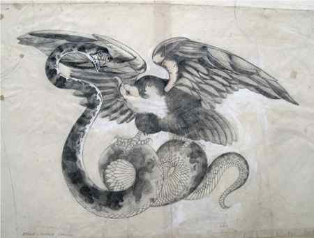
Both Molly and I worked on the Eagle and Snake Tattoo drawings, first we made pencil drawings and then traced them onto film using black ink for the final separations. The Mother Tattoo was drawn from a wood engraving I had made at Art school – Molly drew the Peacock Tattoo in the same way. The Snake and Dagger image was made especially to stretch down the thigh. Smaller Tattoos were made to print on the backside of flesh pink cotton knickers and for the T-shirt arms.

Photography – James Wedge
Through 1968 ‘69 and ‘70, the Tattoo prints generated interest worldwide and continued to sell but we had so many other ideas at full tilt, we never really exploited the possibilities. Printed Tattoos on clothing soon became acceptable mainstream fashion . by then we had moved on to Paradise Garage with an entirely new look – experimenting with prints on Black. Black was always taboo – apart from Black Leather, there were no Black clothes anywhere and so this formed the basis of our next collection of Rock’n’Roll clothing.

In ‘71 Sylvain Silvain hung out at Paradise Garage and returned with the Dolls in ‘72 after Malcolm had taken over the shop. At the height of UK Punk, we designed a collection of T-shirts – “20th Century Rebels” which included a tribute to Johnny Thunders. Thunders was the hottest Rock’n’Roll guitarist throughout the 70’s and the main inspiration for Steve Jones. After the Dolls disbanded Thunders continued as a solo Artist and just went on playing his heart out till he died in 1991.
We made a print of Johnny’s portrait in front of a blow-up of his tattoo “Too Fast To Live – Too Young To Die” – the Dolls montaged into the background. In the 80’s Johnny visited our studio in NW10 – he was curious about our setup. He applauded our passion with Rock’n’Roll T-shirts and it was cool to be included in our Rebel Collection. We made him a Black on Black Snakeskin suit for his UK tour.
Thunders and Dolls 45s were always on the Jukebox.Our favourite tracks of all time:
1. “Babylon” – The New York Dolls
2. “Trash” – The New York Dolls
3. “Who are the Mystery Girls” – The New York Dolls
4. “Looking For A Kiss” – The New York Dolls
5. “Personality Crisis – The New York Dolls
6. “Jetboy” – The New York Dolls
7. “Vietmanese Baby” – The New York Dolls
8. “Subway Train” – Johnny Thunders
9. “Chinese Rocks” – Johnny Thunders
10. “You Can’t Put Your Arms Around a Memory” – Johnny Thunders

In the 80’s we made drawings of the Too Fast To Live motif in positive and negative form as a continuous print.

In ‘76, when we opened at KITSCH-22 – 22 Woodstock Street W1, we overprinted the Tattoos on another revived T-shirt print, the Breasts T-shirt. This print never left the print-table for long. With ‘BOY Blackmail’ we continued to produce it through to the mid eighties. The photo was one of a series of pictures Derek Hutchins made for the BOY blackmail catalogue.

Photography – Martin Lewis
Later in the 80’s our prints became mainstream. They gradually morphed into becoming ‘fashion products’. This picture of the Dagger print in ID Magazine reminded us that images which appeared diluted for us still had some potency when mixed by the ID stylist into a unique eclectic ensemble.

At the end of the eighties, there was a further Tattoo idea I just had to make as a T-shirt – a celebration of Lou Reed’s classic LP “Rock’n’Roll Hearts”. That line “deep down inside I’ve got a Rock’n’Roll heart” was just pure poetry – our cultural romanticism. This Polaroid of the beautiful Wendy May is a great memory of those Rock’n’Roll days.
Wendy’s own tattoo is “Too Fast To Live, Too Young To Die” – she’s so real.
Photography – Andy Sotiriou
Artist, Dan Perfect, wears the Rock&Roll Hearts Tee with Modzart Blue Moonjeans.

Photography – Barbara Bellingham
Alice Hiller wrote in ‘The Observer’ “John Dove and Molly White have been designing and hand-printing T-shirts since the late Sixties when they were among the first people to start exporting them to America. Originators of the Seventies glitter T-shirt and the Punk black-on-dayglo Tiger stripe designs, they now produce 1000 T-shirts a week. This years best sellers show a torn picture of the Mona lisa, captioned ‘Anarchy Is Art Isn’t’ and a ‘Rock’n’Roll Heart’ tattoo (pictured above)”.

A Polaroid from friends at “Olmo” in Berne, Switzerland with a complementary touch.
At this time, the Japanese became aware of our designs and by the mid-eighties half of our T-shirt production was going out to Japan. To celebrate our connections with Japan, Molly and I made updated drawings of the Eagle and Snake Tattoo design and produced silk T-shirts in an oriental style.
Tattoos in Tokyo of course, had a very different kind of history to the UK – a world away from Anglo-American street fashion and remained within that traditional Japanese underworld culture.
THE PAINLESS TATTOO EVOLUTION
September 1967 – Art Director, Bill Fallover, had just commissioned my first drawing for NOVA magazine – a portrait of writer Patrick O’Donovan – an autobiographical piece on his perception of what it’s like to be a ‘liberal catholic’ called “God and I”. This seemed the best opportunity to indulge myself of my interest in Tattoo art. I had been given a brilliant photograph by John Deakin of Les Skuse’s Tattoo Club in Bristol. Les had won acclaim for being the best Tattoo Artist in England in 1966. The Deakin picture would inspire an entire collection of drawings and prints – it started with Jesus .

A tattoo on the bare torso of Patrick O’Donovan gave me grief with him and the editor, Dennis Hackett. Both wanted to axe it. A quote from Pat’s article says it all – “Catholics can be perfectly bloody and must seem at times intolerably dull.”

This little incident took me by surprise and woke me up to the taboos that surround Tattoo Art. It gave me a brief insight into its subversive power – we started to draw Tattoos. Suddenly, there seemed to be a lot more tattoos – we talked to anyone we met with tattoos and checked out those famously tattooed characters around Soho at the Golden Lion Pub in Dean Street, the French House and the Coach and Horses.
Classical Tattoo subjects of wild animals – Eagles, Snakes, Panthers, Leopards etc., looked great on the body. I’d had ideas for making tattoo images from neon signs, pin-ups, cars and refrigerators but these were abandoned for the more traditional images to give more authenticity to the illusion of a tattoo on the body.

Molly had utilised nineteenth century acid dye processes with her silk printing and she used Gelatin and Bicromate for the transfer of images to the screens. Now we thought we should research the new chemistry coming through with the first screen print supply company in London – Sericol, in Parsons Green. They specialised in inks for the commercial art industry – everything for paper, nothing for fabric. On the other hand, their new photographic emulsions were simple to use and we soon had the designs developed, up and ready to print on translucent skin-tight body stockings and T-shirts that we had dyed flesh coloured. We had found a company in Northern Ireland, Polyprint, who had imported pigment textile dye stuffs from the US. They were just the greatest – they intermixed with practically anything and were really fast and tough after a good baking always remaining soft to the touch. We have some T-shirts printed in the 60’s that have literally been worn to bits but they still retain the freshness of the printed image.
We printed the tattoos on government surplus cotton and silk jersey T-shirts that had been made by Morley for the British Army in the 50s. The other vests we used were from Invicta, a standard underwear company.

The Rock’n’Roll Hearts drawing was the first in a series of prints where the drawing dominated the print. Our usual concept of making prints was to allow the flow of the process to take over. Using half-tone separation to enhance the delicacy of the line, we followed through with the print of a continuous undulation of crushed Tattoo T-shirts.
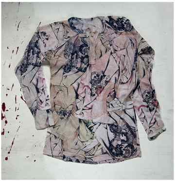
In June 2008, Paul Gorman of THE LOOK PRESENTS commissioned the Snake and Eagle Tattoo T-shirt to be reproduced for Topman under the WONDER WORKSHOP label – a slightly enlarged image printed on a biscuit tan colour especially for men in place of the original flesh pink. The negative version on black didn’t get made but we’ll use this idea later!