We won’t use this for mixing green, but I wanted to note it just in case. This is my alternative to Primary Red. This Magenta can still produce beautiful and rich shades, but unlike Primary Red, it helps bring the colors more towards the “jewel tone” space. I use a lot of purples in my work, and primary red can sometimes be a bit too warm and it muddies up the purple. Magenta is a great alternative because it is already mixed with the warmth of the red but incorporates some of the cooler tones as well.
MONSTER – medium green, high grade professional acrylic paint, by Stuart Semple 100ml
After 15 years of making his own paints, Stuart Semple has been able to formulate and release a new breed of acrylic paint. For the first time his FULL RAINBOW palette is available to all artists*. Share in these incredible colours.
POTION is made in small batches in a paint factory attached to Stuart’s studio in England, These are extremely special paints that only use the very best pure acrylic resins, they’re mega-saturated with the finest quality pigments in the world. Stuart has also added a distinctive scent to each of his colour creations. Unlike other commercial paint brands (mentioning no names) there’s absolutely no scrimping on quantity or quality of ingredients here.
Stuart has designed these paints to withstand the demands and challenges of today’s contemporary painters.These are not student quality or craft quality paints, These super potent mixes are made to pack a punch on a variety of surfaces and stand the test of time. Meaning your work will stay brilliant and vibrant for centuries.
In the usual open-source spirit, these paints have been designed to play perfectly with almost any other acrylic paint or medium that you might already be using.
POTION can be used on canvas, paper, wood, plaster, fabric, masonry and almost any non-slick, non-oily surface.
- Air dry in approx 30 mins at 21 degrees centigrade, re-coat after 3 hours.
- Water resistant when dry
- Water soluble when wet
- Brush – straight from bottle
- Roller – dilute with 10% water
- Airbrush / spray – dilute with 20 – 25% water
- Outdoors – yes!
- Lightfastness – as good as it gets!
- Archival quality – of course
- Coverage – one bottle approx 2.4 x 2.4 meters (varies depending on absorbency tested on gesso’d canvas)
- Fabric – yes it sticks well to most fabrics. It will make it stiff, if you add water it might reduce the colour. When dry, it’s permanent so no heat setting needed. Hand wash clothes and dry on the line. Leave for 5 days before first wash.
- Compatibility with other acrylics & mediums – plays nicely with most mediums and acrylic paint brands.
- Scents – what twisted mind makes bubblegum and parma-violet scented pro acrylic paint?
- Clean up – wash with warm soapy water, don’t let it dry on your brush.
*YES all artists! It’s time the miserable ones had a bit more colour in their life – Stuart wants to share the rainbow with them, he thinks they need it.
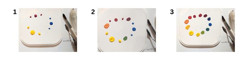
Mixing Green – The Basics
The foundation of color mixing is the three primary colors – red, yellow, and blue. By mixing these primary colors together in different combinations you can create all the colors of the rainbow. The colors that make green are yellow + blue. If you have primary yellow and primary blue in your paint set, you’ll be able to mix green!

My favorite colors for mixing vibrant green
The only problem with using primary colors for color mixing is that the colors they produce end up looking a little dull and muddy. I personally use a different set of primary colors in my paint kit! After years of experimenting with different color combinations, I’ve finally come up with three that produce the most vibrant acrylic colors!

Turquoise Blue
I use Turquoise Blue instead of Primary Blue. It’s dark enough to create beautiful deep shades for cooler colors, without them verging on looking muddy.
I stick with the basics when it comes to yellow. This helps balance the turquoise and keep the greens in the right hue family. It is bright enough to create vibrant hues and mixed with the magenta and turquoise it produces great results. If I ever need to add more vibrancy to a warm tone, I tend to add a fluorescent color to help make it pop.